
About
Representation
View all Representation →Consultations- Digitisation Taskforce – Final Report
- FCA Consults on Fund Product Information and Cost Disclosure CP24/30 – ShareSoc Responds
- FRC Consults on UK Stewardship Code – ShareSoc Responds
- FCA Consultation – Modernising Redress
- HMRC Consultation – IHT on Pensions
- ShareSoc Evidence to Lords on FCA Enforcement
- ShareSoc supports FCA proposal for criminal background checks on owners and controllers of financial institutions
- UK ISA: ShareSoc submits consultation response
- FCA Consultation on Enforcement Practice & Transparency
- ShareSoc response to House of Commons Education Select Committee
- UKSA and ShareSoc Submission to Labour Party Review of Financial Services
- FCA Consultation GC23/2 Financial Promotions on Social Media
- VIEW ALL CONSULTATIONS
Education
Events
- Forums
Portfolio Review 2020 – Mark Bentley
The ShareSoc blog provides news and informal commentary from directors, members and other contributors. Entries reflect the personal views of the authors, which do not necessarily reflect ShareSoc’s formal position. Contributors may hold shares in the companies mentioned. Nothing in this blog should be viewed as financial advice. You may submit comments on blog posts, but ShareSoc reserves the right to remove or edit inappropriate or defamatory submissions.
Background
I have not published a portfolio review for quite a while, as it’s so time consuming to do. However, 2020 was an extraordinary year, so felt I really ought to see what went wrong, what went right and whether there were any lessons to learn.
Before diving into the details, I need to explain my circumstances and investment strategy. I have been a full-time investor since 2004, living off a fixed pool of capital. Therefore, capital preservation whilst generating sufficient return to cover my living costs is crucial. To meet these objectives, I run a highly diverse portfolio, containing different types of assets.
My overall portfolio is split between a SIPP and an ISA, with the bulk being in my SIPP (from which I now draw a monthly income).
Asset Allocation
The breakdown between asset types and accounts (at the end of 2020) is illustrated in Figure 1:
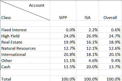
Figure 1 – Asset Allocation
To explain the non-obvious asset types:
- “High yield” are equities yielding in excess of 3%, that don’t fall within other asset types
- “International” are mainly investment trusts with a global focus
- “Other” are equities attractive to me that don’t fall into any of the other asset types
The cash % shown represents cash within the SIPP and ISA accounts. I also hold significant cash outside those accounts, which is earmarked for a house purchase in the relatively near-term. The reason for the relatively high % of cash in my ISA at the year end will become apparent shortly…
Luck
Whilst we all like to think that our investment returns depend primarily on our own skill & diligence, luck plays an important part too. I had two important pieces of luck which significantly influenced my returns this year:
- Late in February, I was fortunate to have access to some very well informed opinion regarding the nature and threat of the SARS-Cov-2 pandemic, which markets hadn’t yet fully recognised at the time. That allowed me to reduce some of my holdings and reserve some additional cash at that time. When I dive deeper into the performance of my portfolio, you will see the impact of this.
- The cash I had set aside for my house purchase provided a useful cushion/comfort blanket. As markets plunged in March, I took the decision that I would be prepared to deploy some of that cash into my ISA, if necessary, so that I could take advantage of bargains that the plunging market threw up. In the event, I only deployed about half of what I would have been prepared to use. This created a psychological advantage, in that I didn’t fear adding to investments that might go lower – knowing that I could continue to invest if even better bargains became available.
My experience of the financial crisis was invaluable: knowing how scary a crashing market could be but also remembering that my best ever investment returns were in the years following the 2008 crash. This does not mean that one can invest indiscriminately: some companies will be permanently impaired, but it was possible to identify businesses that were well placed to survive the impact of the pandemic (or, indeed, to thrive), but which the market had sold off indiscriminately. Keeping a cool head and not panicking are vital.
I did indeed deploy about half of the earmarked cash that I was prepared to invest – and by the end of the year had realised sufficient gains in my ISA, that I could withdraw that cash again (and some extra!). That explains the high cash weighting in the ISA at year end. I intend to leave that cash in the ISA, until I am ready to make my house purchase.
Another piece of good fortune was the timing of the market plunge: around the end of the tax year, meaning that I could use both the 2019/20 and 2020/21 ISA allowances to add cash, if necessary.
Results Breakdown
Figure 2 shows the total return achieved by each asset type in each account over 2020:
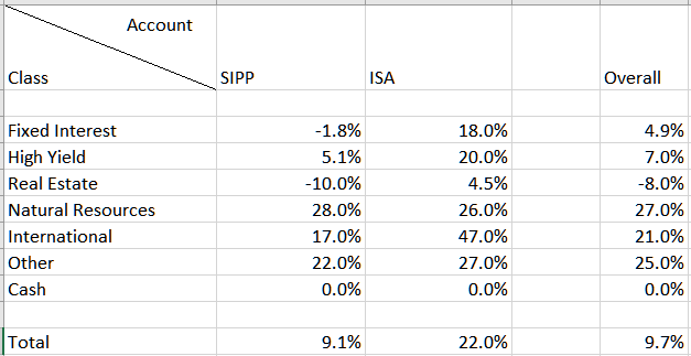
Figure 2 – Total Return Breakdown
This illustrates several interesting things:
- Which areas of my portfolio did well and which didn’t (and shows the benefits of diversification – hard to predict in advance what the outperformers/underperformers would be).
- The benefit of being able to inject additional cash into my ISA at the right time, resulting in significant outperformance for that portfolio.
How did I obtain that breakdown of performances? I use SharePad and its group portfolio feature to analyse my portfolio performance. Each cell in the table (e.g. SIPP/High Yield) is represented by a “base” portfolio I have set up in SharePad I then use group portfolios to create aggregated portfolios a) for the SIPP and ISA (to match my broker accounts); b) for each asset type, across both accounts. SharePad calculates the total return for each of these base and group portfolios.
Note that the total overall performance is dragged down as it includes (minimal) returns on my cash savings held outside the SIPP and ISA. Conversely, in a negative year that cash element would cushion returns.
Clearly, these returns are not spectacular but I am satisfied to have achieved a decent positive result in a difficult year.
Deeper Dive
Now let’s drill deeper into each of the asset type portfolios. For each of these I identify the top 3 “contributors” to performance, and the bottom 3 “detractors”, with some commentary on each. I also list all portfolio components (some of which have been sold by year end) and whether they contributed or detracted “+” indicates a contributor and “-” a detractor “++” a strong (but not top 3) contributor and “–” a strong (but not bottom 3) detractor.
For each of the asset type portfolios, I also show a chart that illustrates relative performance over the year, generated by SharePad. The dark green line on each chart shows the portfolio value and the light green line shows the value of the FTSE All Share Total Return index, as a benchmark.
Figure 3 below is the corresponding chart for my combined portfolio of SIPP, ISA and savings:
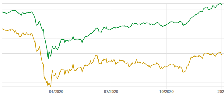
Figure 3 – Overall Returns
Notably the drawdown in my combined portfolio in March from the start of the year was around 22% vs 36% for the FTSE All Share. That is where the cushioning effect of the cash element comes into play. Pleasingly, as the year progressed, my portfolio increased its positive divergence from the benchmark. Note also that the chart (both for my portfolio and the benchmark) includes the impact of monthly withdrawals from my SIPP.
I also benchmark my SIPP against the performance of the RIT Capital Partners investment trust (RCP). I chose that because it also has a strong focus on capital preservation – and if I can’t beat it, I would be better off just investing in there. Since starting to monitor in 2006, I have outperformed it, so continue to be happy running my own portfolio.
As Fixed Interest only represents 0.6% of the total portfolio (due to limited attractive opportunities), I won’t analyse that asset type.
High Yield
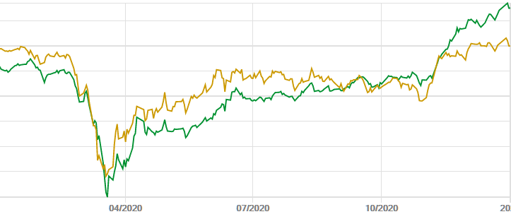
Figure 4 – High Yield Portfolio Performance
We can see the HY portfolio started the year underperforming the benchmark, but overtook it in the latter part of the year and now appears to be racing away (time will tell whether that continues!).
Top 3 contributors:
- Somero (SOM). A classic example of a stock I was able to add to very cheaply in March and which has nearly doubled since those lows (I took some money off the table in June). The market overestimated the impact of US economic shutdowns on the company, but Somero has a number of advantages: the equipment it makes and sells is used outdoors, so not affected by restrictions on indoor workplaces; its products are used in constructing logistics assets (amongst others), much in demand with the rise of eCommerce.
- K3 Capital (K3C). Another business that sold off excessively, allowing low-priced additions. By adding an insolvency and restructuring business to its portfolio, it is somewhat insulated from economic downturns. In good years its M&A advisory businesses should do well and in bad ones, its restructuring services should benefit.
- IG Markets (IGG). A great business – and dips provided good opportunities to add to my holding.
My holdings of Somero and K3 are now significantly larger than they were at the start of 2020, as I feel they have further to go.
Bottom 3 detractors:
- NAHL Group (NAH). By far the worst performer in this category and, indeed, in my entire portfolio. I sold the bulk of my holding after a mid-year trading update, as I became suspicious that the company would need to raise capital to reduce its debt (which would further decimate its share price). In the event, it received an offer not long afterwards. I retain a very small holding.
My mistake with this holding was to underestimate the impact of a change of business model on the company, forced by legislation changes affecting personal injury claims (and especially RTA – Road Traffic Accident – claims). It is usually a red flag when a company is forced to change its business model. I believed, however, that management had a credible plan to overcome this and had a track record of surviving and prospering after other legislative changes in the past. Further I underestimated the impact of Covid on their business, which affected all areas, with folks staying at home during lockdown significantly reducing accidents of all types and hence the need for NAH’s services. I should have recognised the risks and reduced my holding earlier. Instead, I increased it a little in January, as I thought the share price was too low then, but it went on to more than halve from that point.
- ITV. ITV suffered a “double whammy” from the pandemic. Firstly, advertising revenues were hit both from advertisers pulling in their horns to mitigate pandemic impacts on their own revenues, as well as from cancellation of sporting events. Secondly, content production largely ceased for a period during the first UK lockdown. ITV was one of many major companies suspending its dividend, However, both these issues are temporary and will be overcome, in time, I believe. So, I am happy to continue holding – and the shares have the perennial prospect of a takeover by a larger media player hanging over them. ITV could be a star performer in 2021.
- Wood Group (WG.). Wood was badly hit by the oil price crash in the first half of the year and continues to suffer from its clients trimming their CAPEX plans. However, Wood’s services are used by industries apart from oil & gas, including renewables and the mining industry, which have brighter prospects. Wood also suspended its dividend in 2020, whilst it focused on reducing debt, which it is doing successfully. I am also happy to continue holding shares in one of the world’s leading process engineering & consultancy firms.
Other companies held during the year:
| Company | TIDM | Contributor (+)/Detractor (-) | Comment |
|---|---|---|---|
| Ultimate Products | UPGS | ++ | Several trades during the year enhanced returns, as the stock was volatile. |
| RDL Realisation | RDL | ++ | Realisation situation successfully arbed and now sold |
| Doric Nimrod Air III | DNA3 | ++ | Took advantage of excessively low share price, now sold |
| City of London investment Group | CLIG | ++ | One of my largest holdings |
| Hargreaves Services | HSP | + | |
| Direct Line | DLG | + | |
| Sequoia Infrastructure | SEQI | + | Also a large holding |
| Fair Oaks Income | FAIR | – | Currently my largest holding, as recovering strongly from lows and has resumed large dividend payouts |
| Keller | KLR | – | |
| EasyJet | EZJ | – | Sold early in the year, minimising losses. Not tempted to re-enter yet, as I believe it will take quite some time for airlines to recover |
Real Estate
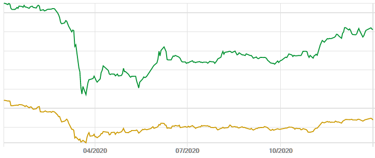
Figure 5 – Real Estate Portfolio Performance
As can be seen in Figure 2 above, real estate was the one asset type that generated negative returns in 2020. Despite that, the above chart shows that the asset type has significantly outperformed the benchmark, both in the long run and over the course of 2020. The March drawdown for this asset type was similar to that of the benchmark.
Top 3 contributors:
- Aberdeen Standard European Logistics Income (ASLI). ASLI shares sold off, with the rest of the market, as pandemic fears mounted. However, the market rapidly came to realise that of all the subclasses of the real estate asset class, logistics assets (warehouses) were the most attractive. Demand for such assets benefits a) from the realisation that maintaining some buffer stocks is essential when supply chains are disrupted, as happened in the early stages of the pandemic; b) the rise of eCommerce. Consequently ASLI was able to collect most of its rents and maintain its dividend. It started the year at a modest discount to NAV and ended at a meaningful premium, as the market came to understand these attributes. I was also able to add to my position significantly in February and March, as the shares sold off. I realised profits on most of those extra shares over the rest of the year, as SUPR (see below) appears more attractively valued to me, with similar resilient characteristics.
- TR Property (TRY). I have huge respect for the manager of this investment trust, Marcus Phayre-Mudge. It consistently outperforms its sector, through shrewd asset selection. A big position in German residential property and avoidance of retail traps were big boosts this year. Nevertheless, the trust has traded at bigger than usual discounts to NAV for much of the year (5% discount is historically typical), and I have taken advantage of that to increase my position significantly (now amongst my top 5).
- Supermarket Income REIT (SUPR). Only a small contributor, for two reasons: 1) unlike ASLI, the share price didn’t decline that much during the March selloff, so topping up then wasn’t a priority; 2) the share price has been held back due to a large share issue creating a bit of an overhang (from traders) in October. I participated in that issue, so SUPR is also a top 5 holding now, justified by a good, inflation protected & reliable yield (currently 5.5% – very rare these days). I am confident that the share price will recover in 2021 as the overhang clears. Note that SUPR is presenting for ShareSoc later this month.
Bottom 3 detractors:
- NewRiver REIT (NRR). Unfortunately, I started the year with a fairly large position in this stock (and only reduced it slighted as I became aware of the likely impact of the pandemic). It has been hit hard by forced closure of non-essential stores and its pub portfolio. The shares sold off hard towards the middle of the year, with the market seemingly assuming that a capital restructuring would be required to reduce debt. However, I have followed this company since it floated (and presented to ShareSoc members in 2014) and have a high degree of confidence in its management and their strategy and they presented solid reasons why such a restructuring would not be necessary. One reason is that a significant part of the debt is in the form of unsecured US bonds, not due until 2028. Note that Fitch has recently confirmed the investment grade rating of BBB+ on these bonds. That gives confidence that NRR will be able to service its debt for the foreseeable future. Following the March selloff, I added significantly to my position, at an average price of 66p, anticipating a recovery in the business in due course (and feeling that the risk/reward balance was favourable). With the shares now standing at 84.6p NRR has grown to become my 2nd largest holding.
- Palace Capital (PCA). Another company I have known and held for many years. Unfortunately I have much less confidence in this company’s management and portfolio, so have been selling shares in January and April, crystallising losses. I now only have a modest position. There is scope for recovery, so have not sold out altogether.
- AEW UK REIT (AEWU). Unlike NewRiver and Palace, AEWU has not cut its dividend at all, but that has not prevented the market taking a bit of a dislike to its shares. With a strong focus on logistics and industrial assets and good rent collection, I am reasonably confident that the company will be able to maintain its dividend, which makes the shares highly attractive at current levels (yielding over 10%), so added to my position over the course of the year.
Other companies held during the year:
| Company | TIDM | Contributor (+)/Detractor (-) | Comment |
|---|---|---|---|
| Home REIT | HOME | + | Shares bought in IPO |
| Real Estate Credit Investments | RECI | – | Results and outlook over the year look sound, offering 9% yield. I added to my position at depressed prices over the course of the year. Share price has been recovering, but not fully recovered yet, hence a small loss over the year. |
| Persimmon | PSN | – | Dabbled briefly and unsuccessfully in March. Nervous of housebuilders since due to UK economic uncertainty. |
| Watkin Jones | WJG | – | Added to position over the course of the year, though still modest sized. Shares recovering nicely, but not fully recovered yet. Like their business model. |
| PPHE Hotel Group | PPH | — | Having previously taken profits, only had a small position at the start of 2020, and sold out completely in March, with huge uncertainty over the outlook for hotel groups. A loss for me within the year, but a substantial profit since investing in 2016 |
| Crest Nicholson | CRST | — | Started the year with a midsized position, took some profit in January, but then crystallised a major loss in May, as I lost confidence in the housebuilding sector. |
Natural Resources
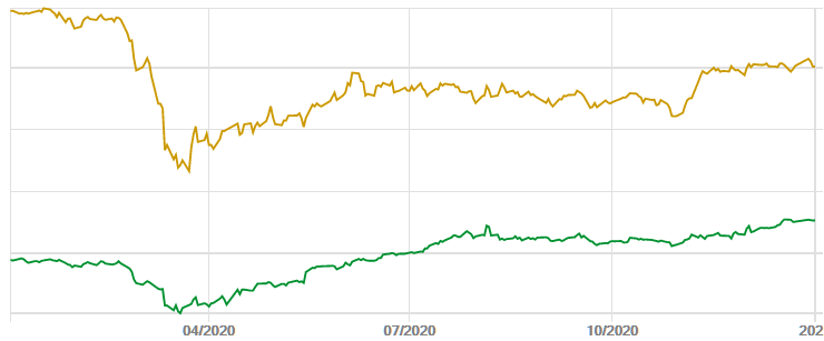
Figure 6 – Natural Resources Portfolio Performance
This chart is a little peculiar, because this portfolio (dark green) suffered significant losses in 2015 and underperformed in 2016-2019, so started the year well behind its benchmark (light green). It also slightly understates performance because two significant holdings are Canadian quoted companies, which can’t be included in SharePad portfolios, so are omitted. Nevertheless, the significant outperformance over the course of 2020 can be clearly seen.
Top 3 contributors:
- Pan African Resources (PAF). A South African gold miner which started the year at 12p. I was able to add during the March selloff at 8.69p and the shares now stand at 23.6p, after a much improved operational performance and a strong gold price over the course of the year. I have also taken some profits over the course of the year and now hold 33% fewer shares than I did at the start of the year, but the value of the position is now 30% higher than it was at the start of 2020. PAF was the biggest single contributor to overall portfolio performance this year.
- Blackrock World Mining Trust (BRWM). A stalwart of my portfolio for many years, I traded this quite heavily over the course of the year, adding when the trust traded at a high discount to NAV and trimming when the discount fell. The trust is currently trading on a historically low discount, so I have reduced my position size significantly since the start of the year, when it was one of my largest holdings. It still remains a large holding, with the share price having climbed from 383p to 522p now (via 220p at my cheapest purchase during the year, in March!).
- Endeavour Mining (TSX:EDV). You may not have heard about this gold miner yet, but you will: it is slated to dual list on the LSE in mid-2021, when it will probably go straight into the FTSE100. I have held it since 2012 and it has been an extraordinary story, growing from a 200koz p.a. junior to a major which is expected to produce 1.5Moz p.a. on completion of its latest acquisition in early 2021. When that acquisition completes, it will be the largest gold miner in West Africa, operating principally in Burkina Faso, Cote d’Ivoire and Senegal. The shares benefited from the strong gold price and successful integration of a major acquisition made in mid-2020, which took it to 1Moz of annualised production. With a low AISC (all-in sustaining cost) below $900oz, it generates very substantial cashflows with gold prices anywhere near their current levels. Shortly before reporting its latest acquisition, the company announced its maiden dividend.
Bottom 3 detractors (there were only two detractors this year, all other investments producing positive returns):
- Enteq (NTQ). I started the year with high hopes and a small to midsized position in this company, which designs, manufactures and sells specialised oilfield tools. Two reasons for optimism: a recovering oil price, leading to higher CAPEX spend by E&Ps; and an increasing product range. The first of those reasons got blown out of the water by the oil price crash in the early part of the year, which is still affecting Enteq’s largest US market now. I didn’t trade the shares during the year, so now have quite a small position. The company has a rock solid balance sheet (most of the market cap. covered by net cash) and good intellectual property, so I am reluctant to sell.
- Rio Tinto (RIO). I dabbled in this in January and got scared off when I learnt about the likely impact of the pandemic. Would have been a winner if I’d simply held! Only a modest loss, though.
Other companies held during the year:
| Company | TIDM | Contributor (+)/Detractor (-) | Comment |
|---|---|---|---|
| Ivanhoe Mines | TSX:IVN | ++ | Earlier in the year, I would have liked to hold more of this stock, but AJ Bell won’t allow me to hold it in the SIPP, so can only have an ISA holding. IMO the shares are pretty fully priced now. |
| Blackrock Energy & Resources Income Trust | BERI | + | Traded this quite heavily over the course of the year, with modest results |
| Triplepoint Energy Efficiency Infrastructure | TEEC | + | Subscribed in IPO |
Whilst I used to include oil & gas companies in this portfolio, I no longer do so, as I feel that that industry is now in secular decline.
International
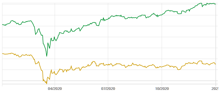
Figure 7 – International Portfolio Performance
As Figure 2 shows, this portfolio has been a good performer in 2020 and a star within my ISA.
Top 3 contributors:
- International Biotechnology Trust (IBT): growth and income!
- Harbourvest Global Private Equity (HVPE). Traded this successfully, trimming my holding in late February @ £18.05 when I became aware of the pandemic risks and repurchasing at £14.90 and £9.03 in March, in the market panic. Moderated my position size in May but size has grown again with the SP closing the year @ £19.46.
- Jupiter Emerging and Frontier Income Trust (JEFI). I have held this since its IPO in 2017 and traded it successfully this year. A peculiarity of this trust is that it generally has an annual redemption at NAV, when the shares trade at a persistent discount. I took advantage of this, opting to redeem half my holding and repurchasing that half at a discount to NAV in the market. Reviewing the long term performance of this holding, I am not totally convinced, so in December have reduced my position (which was my largest holding before that) and reinvested in Asia/EM trusts TEM and JAGI. JEFI still remains a large position. I will monitor performance against those other trusts closely and decide whether to reallocate that investment further.
Bottom 3 detractors. There were only two small detractors in this portfolio:
- JPEL Private Equity (JPEL): a fund that is realising its assets and returning cash to investors. A small loss in 2020 as the share price declined, but a large asset sale and share redemption just announced, which should lead to profits in 2021.
- Almost broke even trading shares in the Canada General Investment Trust (CGI). Decided to sell out when I could as the liquidity of this dual-listed trust is so poor in London.
Other companies held during the year:
| Company | TIDM | Contributor (+)/Detractor (-) | Comment |
|---|---|---|---|
| JP Morgan Global Growth and Income | JGGI | ++ | A solid performer, also producing a good income. Traded successfully in the year, buying on the March dip and selling some at significantly high prices later in the year. Finished the year with more shares than I started with, at negative net cost. |
| JP Morgan Emerging Markets | JMG | ++ | Added to my holding of this outperformer in the March dip and have not sold any shares. |
| Fidelity Asian Values | FAS | ++ | Likewise added to my holding in the March dip and have not sold any shares. |
| Hg Capital Trust | HGT | + | Also added in the March dip but subsequently trimmed this longstanding holding as it moved to a premium to NAV |
| Worldwide Healthcare Trust | WWH | + | Solid performance continues |
| Ocean Wilson | OCN | + | Doubled my position over the course of the year, with opportunities to add at exceptionally low prices in the first half of the year. This company is a strange hybrid of an investment portfolio and a substantial Brazilian quoted ports business. At times in 2020 it was possible to pick up the shares at little more than the value of the investment portfolio, despite the ports business having substantial value on the Bovespa. |
| RIT Capital Partners | RCP | + | I started the year with a CFD short position on this stock (as a hedge) as it was trading at a historically high premium to NAV. As pandemic fears spread, the premium declined and I covered my short. Then as the shares moved to a discount, I bought the shares and as the discount increased opened long CFD positions too. These proved profitable too as RCP performed well. I retain a long CFD position, as well as an ISA holding, as the shares continue to trade at a meaningful discount to NAV. |
| Fundsmith Emerging Equities Trust | FEET | + | I sold this longstanding holding in October, as it was consistently outperformed by JMG |
| Templeton Emerging Markets | TEM | + | New position in December to diversify from JEFI |
| JP Morgan Asia Growth & Income | JAGI | + | Ditto |
Other
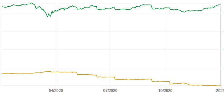
Figure 8 – “Other” Portfolio Performance
This chart is distorted by the fact that most of my monthly SIPP income drawdowns are taken from this portfolio. Nevertheless, it clearly shows the outperformance against the benchmark and that the portfolio has maintained its value despite the drawdowns.
Top 3 contributors:
- DotDigital (DOTD). This high performing UK-based “tech stock” rerated over the course of the year. I topped up in the March dip, but subsequently reduced my position as the shares have become expensive. Still a reasonably sized position, however.
- Keywords Studios (KWS). Another case of a major rerating as this service provider to video games companies continued to perform well. Now a modest holding due to a very high valuation.
- Bioventix (BVXP). Another good performance from this popular and high performing business.
Bottom 3 detractors: No detractors in this portfolio!
Other companies held during the year:
| Company | TIDM | Contributor (+)/Detractor (-) | Comment |
|---|---|---|---|
| RA International | RAI | + | Whilst the company and its shares had a pedestrian performance, I made a useful unrealised gain by topping up @ 36p during the March panic. |
| Judges Scientific | JDG | + | No trades during the year but the company and its shares continued their irresistible rise. |
| Renew Holdings | RNWH | + | Renew’s shares had a bit of a rollercoaster year, finishing slightly below where they started but I took advantage of a big dip in March, banking gains in April and then selling out altogether in December. Renew has been my most profitable single shareholding, having held since 2006 and taking advantage of a distressed share price during the financial crisis. But performance has been uninspiring in recent years and I got fed up by their unwillingness to engage with individual investors. |
| Schroder UK Public Private Trust (fka Woodford Patient Capital) | SUPP | + | A special situation I entered in August, believing that SUPP’s holdings may have bottomed out and the massive discount to NAV may unwind. Only a toe in the water as I wait to see how this evolves (and debt gets repaid). |
| Cranswick | CWK | + | I didn’t trade this high-quality food producer and it gained slightly over the year. |
| Avingtrans | AVG | + | Also no trades and a small gain over the year. Like Cranswick, I believe that Avingtrans’ management is excellent and will deliver significant shareholder value. |
Income Focus
Overlaying the asset type breakdown illustrated in Figure 1, is a deliberate bias towards dividend paying stocks. My rationale for this is as follows. As mentioned in the “Background” above I need to draw an income from my portfolio. Theoretically an income could be produced from a pure capital growth portfolio by simply selling the requisite number of shares each month. This is fine in a bull market, but when the market generally declines, you would be forced to sell more shares at the worst time – when preferably you would want to add to holdings, taking advantage of lower prices (as I did in March this year).
I made the assumption that dividends were more stable/reliable than share prices, so could be relied upon to produce the necessary income, irrespective of market/share price behaviour. The events of March caused me to question that assumption – and whether I should be more “dividend agnostic”, as company after company suspended or cut its dividend. This prompted me to investigate and led me to this report from Link. p6 of the Q2 Dividend Monitor includes this chart of UK dividend payouts since 2007:
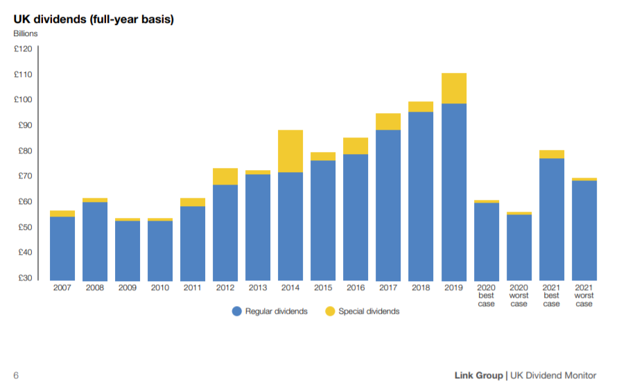
I would have preferred to examine a longer term history but have been unable to find data going further back. I note from this chart that 2020 has been truly exceptional and in general my basic assumption holds true. Even during the financial crisis dividends only fell modestly. The extraordinary conditions of the pandemic have forced many companies to preserve cash and suspend their dividends, but I expect “normal service to be resumed” once the pandemic has been conquered. It is hard to imagine another economic event that would have as big an impact on dividend payouts as a “once in a century” pandemic. Therefore I do not propose to alter my dividend bias significantly – but may allow high performing capital growers (like HVPE) to become a slightly larger proportion of my portfolio.
I hope I haven’t bored you too much with this monster article, but doing the analysis was at least informative for me!
I wish my readers happy investing in 2021 and happier times as this dreadful pandemic, hopefully, fades into history. Stay safe!
Mark Bentley, Director, ShareSoc
7 Comments
Leave a Comment Click here to cancel reply.
This site uses Akismet to reduce spam. Learn how your comment data is processed.

Become a free Associate ShareSoc member
Enter your email to sign up as a free Associate ShareSoc member and receive our emails. It takes a few seconds — and on the next page you'll have the option to customise your membership.
Fascinating review of your portfolio during 2020, Mark. Thanks for sharing the information.
great read, thanks for taking the time to share.
Wow, I clearly have a lot to still learn thankbyou
Fascinating and illuminating. Thanks
Interesting article. Overall performance seems to be similar to mine – see: https://roliscon.blog/2021/01/04/year-end-review-better-than-expected/
Thank you very much for this. Very helpful and interesting!
Perhaps all investors should undertake such an annual review, for the lessons to be learnt from the past year and as a guide to the next. Thank you.